BRAND IDENTITY


Running Latte, a new drive-thru coffeehouse in Roanoke, VA, blends fast service with quality coffee in a brand that’s approachable, friendly, and refreshingly unpretentious—embodied by a custom 'running bean' logo.

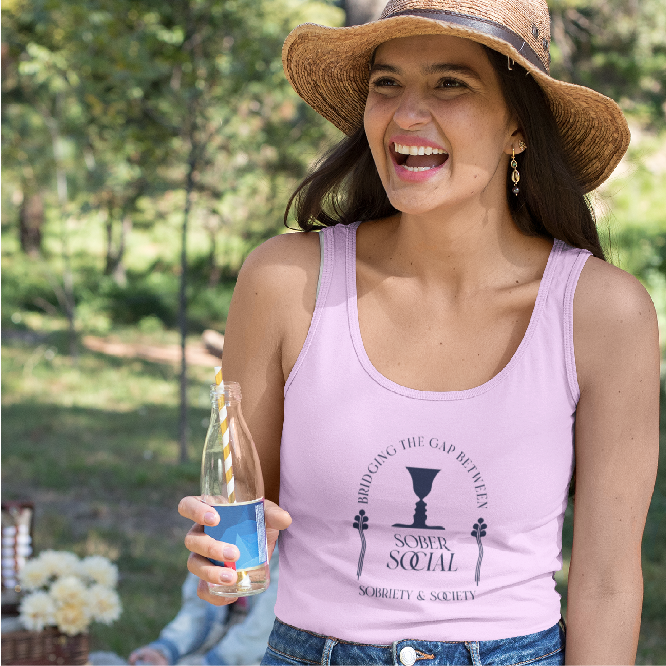

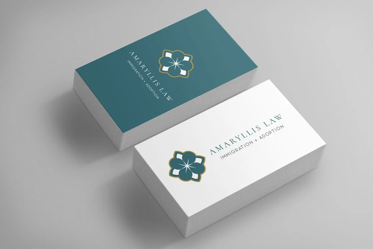
Sober Social, a non-alcoholic bottle shop and gathering space in Wisconsin, combines connection and elegance in a sophisticated brand identity. The refined logo and logotype capture the luxe, feminine feel of the showroom, creating a stylish hub for the NA community


Toast & Jam Group, a promotional product distributor for purpose-driven businesses, recently underwent a vibrant brand refresh. The new identity features a striking palette of magenta, neon yellow, and navy, paired with a bold, timeless typeface, all designed to amplify their mission: creating long-lasting client relationships through the power of promotional products.


When I build a brand identity, it starts with strategy—digging into your business goals, positioning, and messaging to create something that’s not just beautiful, but effective.
For Hive Home Team, we crafted a brand that positions Ashley in the sweet spot between traditional, buttoned-up agents and younger, inexperienced newcomers. The result? Timeless meets trustworthy.
A hand-drawn emblem and pattern, a nod to timeless interiors and artisan tile work, reinforcing a sense of home and heritage.


The Community Roanoke came to Jones Street with a clear purpose and a big heart: to reimagine what real estate could feel like for agents craving connection, not competition. Through in-depth brand discovery, voice development, and creative direction, we crafted a legacy-driven identity rooted in trust, collaboration, and belonging. From a poetic mission statement to a carved-in-time visual concept anchored by oak tree symbolism, every element was designed to feel warm, grounded, and quietly powerful; just like the collective itself.
The final brand strategy delivered clarity, cohesion, and confidence, positioning The Community Roanoke as a standout alternative to traditional brokerages. The result? A brand that doesn’t just sell real estate; it nurtures people, grows careers, and carves out something that lasts.
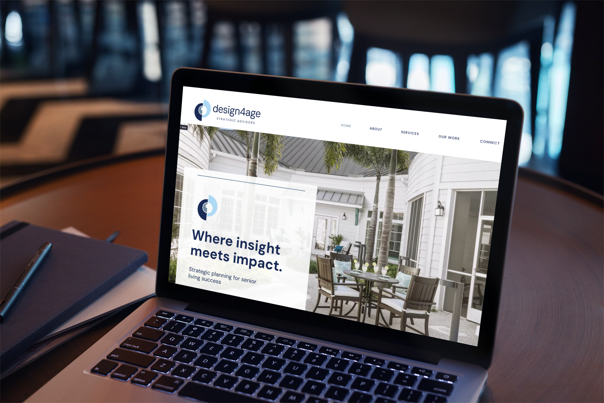


When the founders of design4age set out to create a new kind of consulting firm for the senior living industry, they wanted a brand that reflected their depth of experience, but also their courage to build something different. After decades inside a large design firm, they were taking a leap of faith into a new model. My job was to help them define who they were, where they were headed, and how that could come to life visually and verbally.
Through a collaborative discovery process, we built a brand strategy that clarified their mission and creative direction, then translated it into a sophisticated identity system and website. The result was more than a logo; it was alignment. A visual and verbal expression of their confidence, purpose, and the ripple of impact their work creates across communities.
“The work Meredith does is bigger than logos and graphics—it's about identifying the soul, purpose, mission, vision and unique aspects of an organization and the people who guide the organizations.”
— Melissa P. , Partner, design4age Strategic Advisors


River Birch Wealth Management was ready to transform its existing, generic website into a sophisticated brand experience that converts leads.
The new site tells a compelling story—using engaging imagery, video, and thoughtful copy to illustrate the joy and confidence that comes with smart financial planning. The result is a site that not only informs but inspires, helping clients envision a brighter financial future.
MORE of my favorites