Two veteran women business owners. Two very different brands. One thing in common.
I just wrapped two projects I'm genuinely obsessed with, and I can’t pick a favorite. So you're getting both.
Meet Noble Boots Bookshop and Oya Construction. One is a mobile bookstore just getting off the ground. The other is an award-winning stormwater construction company that's been in the game for years. Both are founded by women veterans right here in Roanoke. And both sat across from me (virtually and otherwise) and told me stories that made designing for them feel like the easiest, most fun part of my job.
Which, to be clear, it already is. But these two made it especially good.
On paper, a cozy mobile bookstore and a heavy-equipment stormwater company have nothing in common. No shared audience. No shared aesthetic. No shared anything, really. And yet the process of bringing both brands to life looked almost identical from where I was sitting.
That's the thing I keep coming back to. And it's the thing I want to talk about today.
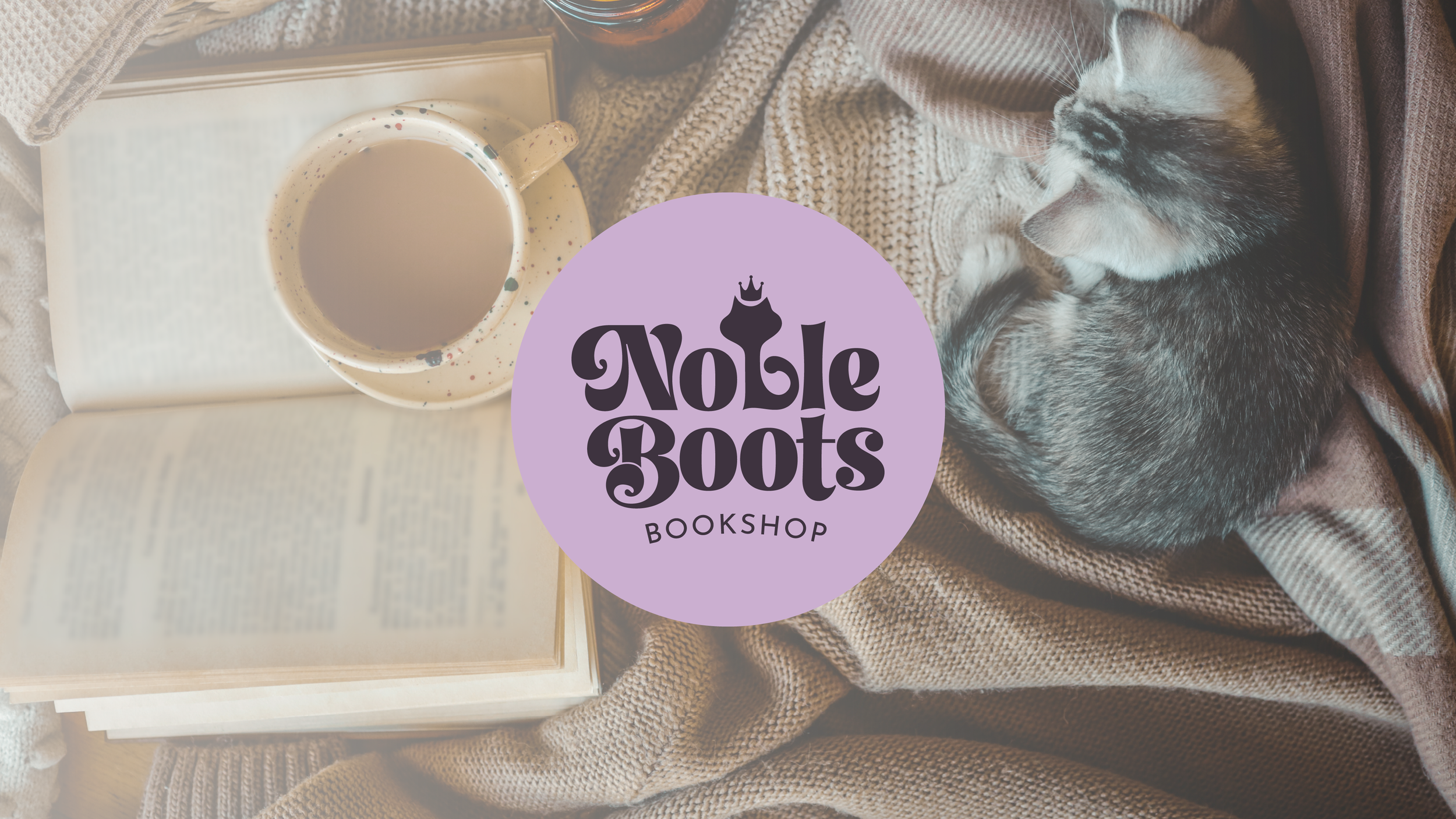
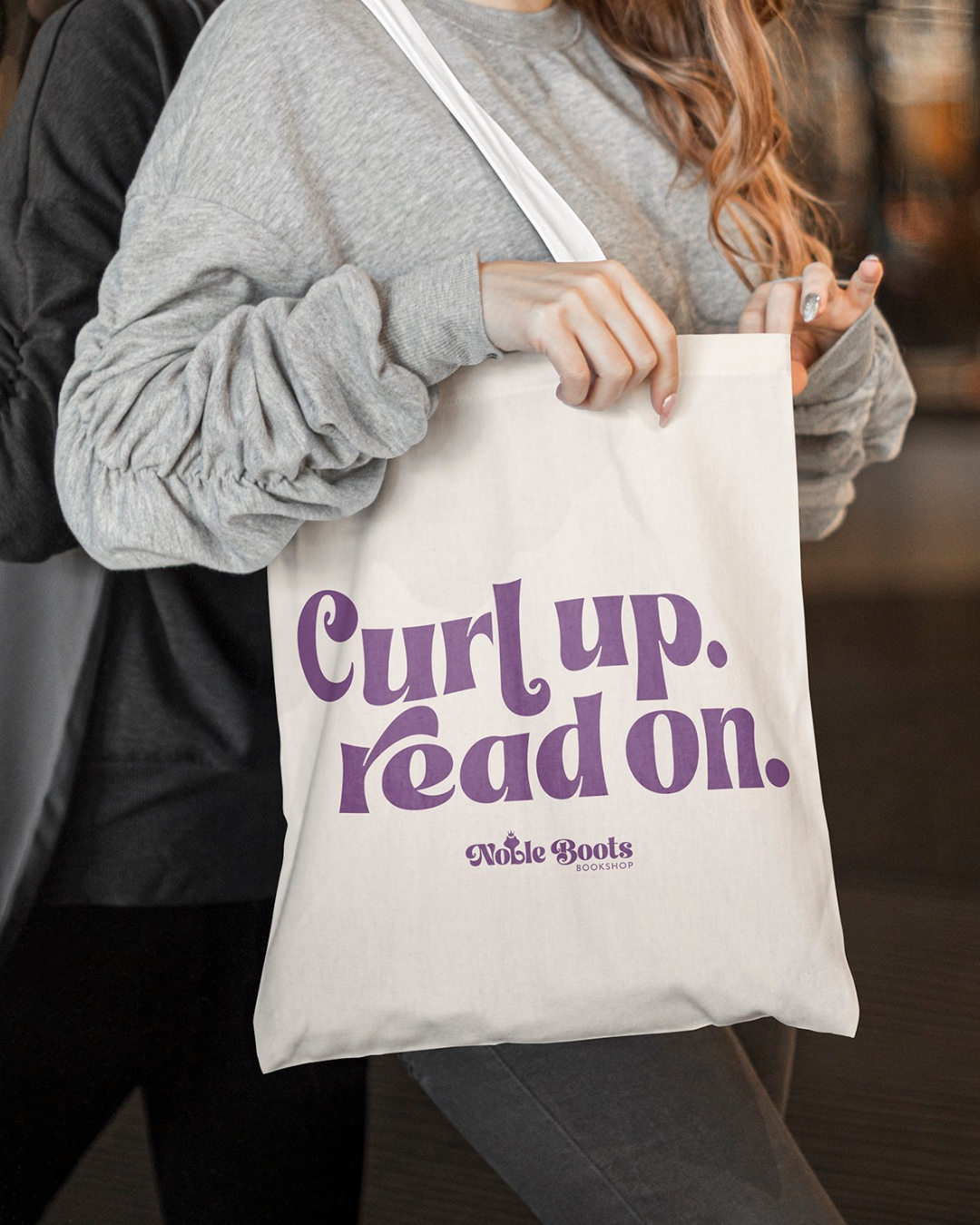
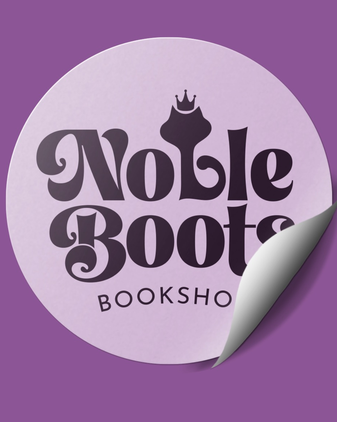
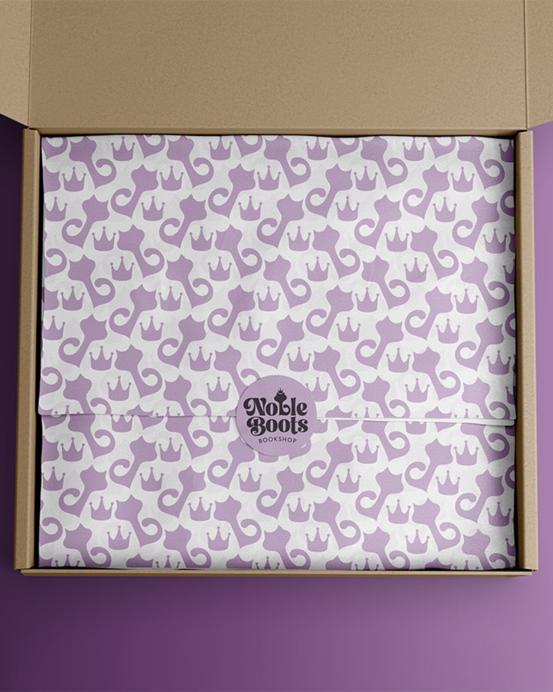
Noble Boots Bookshop: The Cat That Made the Logo
The founder of Noble Boots came to me with a dream. A mobile bookstore. Curated. Community-driven. A little cozy, a little cool.
Great, I said. Tell me more.
And then she told me about Boots.
Boots was an old cat. The kind of cat with that unbothered, scene-stealing energy you can't ignore. The kind of cat who would absolutely have opinions about your book selection if he could talk. I knew immediately this cat had to be in the logo. Not as a cute afterthought. As the heart of the whole thing.
The result is retro, soft, and 100% custom. Boots is illustrated right into the mark because we do not do clip art around here.
Here's what I want you to notice: that detail about the cat did not come up in the official brand questionnaire. It came up because I asked nosy questions and then shut up and listened. If I had stuck to a checklist, Boots would have been a footnote in her life and not the soul of her business identity.
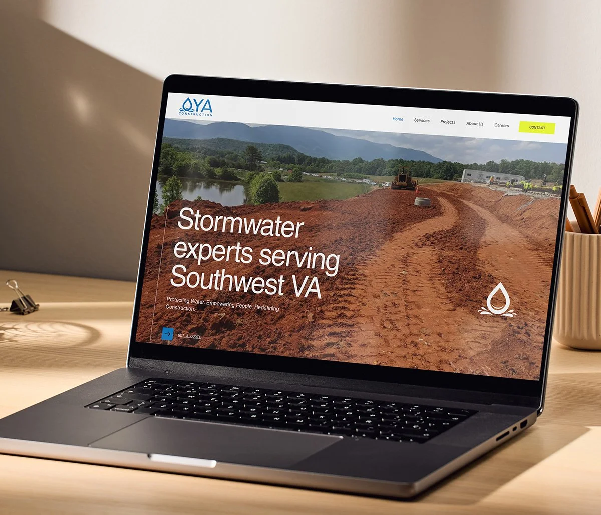
Oya Construction: When the Storm Goddess Needed a Glow-Up
I designed the last iteration of the Oya website years ago, so when they came back for a refresh, it felt like getting the band back together.
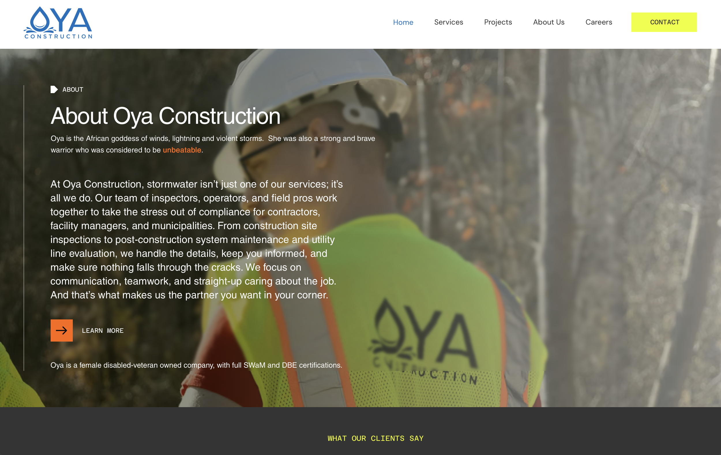
Oya is named after the goddess of wind and storms, which is fitting for a stormwater construction company led by a force of nature. The new site needed to level up to match the reputation this company has built. It needed to show that Oya isn't like every other construction company out there.
My favorite bits? The safety yellow accents that nod to the actual job site without feeling like a hard hat sticker. And the copywriting with personality. A site that basically says, "we will handle your stormwater problem and we will not be boring about it."
I am unreasonably proud of this one.
Construction websites are notorious for being aggressively forgettable. Stock photos of trucks. A stock-photo guy in a hard hat shaking a stock-photo client's hand. Lots of words like "solutions" and "expertise" doing absolutely zero heavy lifting. The temptation to give Oya that same generic template would have been easy. It would also have been a betrayal of who they actually are.
So What Do a Cat and a Storm Goddess Have in Common?
Honestly, nothing.
But in my studio, the process looked almost the same. Long conversations. Nosy questions. Me scribbling notes while the founder lights up talking about the vision she built.
An old cat named Boots. A water goddess named Oya.
Also, can we talk about the fact that both of these founders are women veterans? Building totally different businesses in the same city? I didn't plan that. It just happened. And the magic of that is not lost on me.
This is the part of my job that no software can replace. The conversation. The listening. The willingness to sit in the messy middle with someone while they figure out which detail of their story is the one that needs to be on the website, on the business card, on the side of the van.
Why Generic Brands Happen to Smart Founders
I see this all the time. A brilliant business owner with a story so specific it could only belong to her. And then a brand identity that could belong to anyone. A safe color palette. A font that says "professional" and nothing else. Copy that reads like it was written by committee, because it basically was.
It happens because the process was wrong, not because the founder was wrong. Most design processes are built to extract specs, not stories. Tell me your three favorite competitor websites. Tell me your color preferences. Tell me your target demographic in one sentence.
Cool. Now I have data. I do not have a brand.
A brand is what comes out when somebody who knows how to listen asks the right follow-up question and then waits. It's what comes out when "tell me about your business" becomes "wait, who is Boots?" and the founder leans forward and starts telling a different kind of story entirely.
That second story is where the work actually starts.
Your Brand Should Feel Like You, Not Like a Template
If your brand doesn't feel like you yet, that's what I'm here for.
I am not going to look at your business and apply my house style on top of it. I do not have a house style. I have a process, and the process is conversation. Long, curious, slightly nosy conversation. The kind that surfaces an old cat or a goddess of storms or whatever the equivalent is in your business.
Then I take what you gave me and I build something that could only be yours.
It's why my logos do not look interchangeable. It's why my websites do not read like every other site in your industry. It's why clients stick around for years and come back for refreshes when it's time to level up.
Want More of This in Your Inbox?
If you liked this peek behind the scenes, the rest of it lives in my email newsletter. I send it out a couple times a month. New projects, what I'm learning, the occasional rant about why your homepage hero section is doing too much.
No spam, no shouty sales pitches, no triplet-syntax marketing speak. Just the real stories from inside the studio.
Sign up here and I'll see you in your inbox.